Are you searching for an easy method to style your Contact Form 7 with Elementor? This guide will walk you through every step of the process, helping you create forms that are both functional and visually appealing.
Contact Form 7 remains one of the most popular contact form plugins in the WordPress ecosystem. Its extensive user base is reflected in over 10 million active installations and thousands of positive reviews. Despite its powerful features, customizing the appearance of Contact Form 7 can be challenging for beginners, as it lacks built-in design options.
Fortunately, you can style Contact Form 7 effortlessly using the Elementor page builder along with the PowerPack addon. You won’t need to write any custom code or work with HTML and CSS.
Let’s dive into the process and learn how to make Contact Form 7 visually appealing with Elementor.
Is It Possible to Customize Contact Form 7 with Elementor?
Yes, you can style Contact Form 7 using Elementor by using third-party addons. While Contact Form 7 doesn’t include a native feature to integrate with Elementor, addons like PowerPack for Elementor provide tools to bridge this gap.
PowerPack is a powerful Elementor addon that includes creative widgets for styling popular WordPress plugins, including Contact Form 7. Its Contact Form 7 Styler widget makes it simple to customize every aspect of your form directly within the Elementor interface. You can alter fonts, colors, layouts, and other design elements to create a professional look without needing advanced technical skills.
Below, we’ll show you how to use the PowerPack addon to style Contact Form 7 step by step.
Step-by-Step Guide to Styling Contact Form 7 with Elementor
Plugins You Need
Before getting started, make sure you have installed and activated these plugins on your WordPress site:
- Contact Form 7
- Elementor (Pro or Lite version)
- PowerPack for Elementor
If any of these plugins are missing, download and install them from the WordPress plugin repository.
Step 1: Create a Form Using Contact Form 7
After activating Contact Form 7, create a new form or edit an existing one. To do this, navigate to Contact > Add New in your WordPress dashboard. Customize your form by adding fields as per your requirements. Save the form once it is ready.
Copy the shortcode generated for your form, as you will need it later to embed the form into your page.
To learn more, check out our guide on how to set up Contact Form 7.
Step 2: Open a Page in Elementor Editor
Next, create a new page or edit an existing one. Open the page in the Elementor editor by clicking Edit with Elementor.
Step 3: Add the PowerPack Contact Form 7 Styler Widget
In the Elementor editor, search for “Contact Form 7” in the widget panel. Drag and drop the PowerPack Contact Form 7 Styler widget onto your page.

Check for the PowerPack “PP” icon in the widget’s corner to confirm that you are using the correct widget.
Customization Options in the Content Tab
The Content Tab of the PowerPack Contact Form 7 Styler widget provides options to manage the form’s content and error messages.
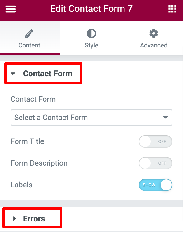
Here’s how you can configure it:
Select Your Contact Form
Use the dropdown menu to select the Contact Form 7 form you want to style. Once selected, the form will appear in the editor.

Add a Custom Title and Description
You can update the form title and description to make it more engaging. Use the toggle options to show or hide the title, description, and field labels. Adding clear and concise instructions for users can improve form completion rates.
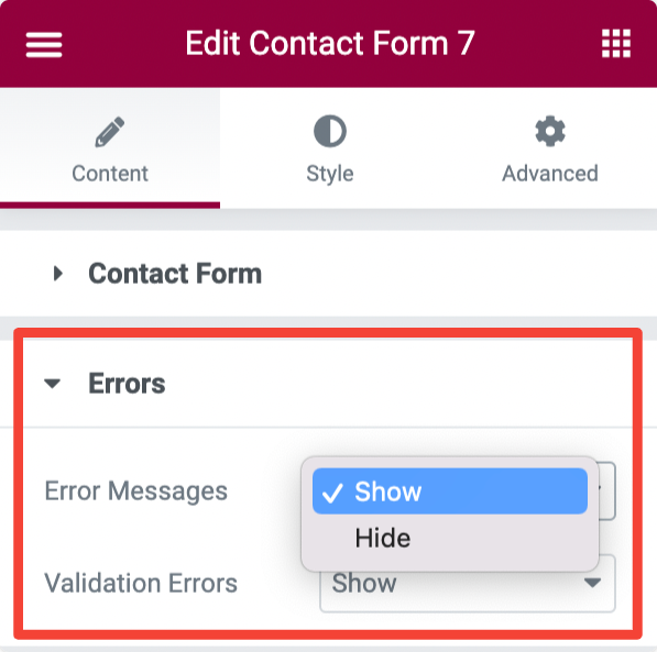
Manage Error and Validation Messages
The Errors section allows you to customize the error and validation messages displayed to users. Adjust the text and formatting to make these messages informative and visually clear.
Customization Options in the Style Tab
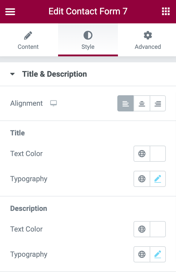
The Style Tab provides tools to change the appearance of your Contact Form 7. Here’s what you can customize:
Style the Form Title and Description
Adjust the alignment of the form title and description (left, center, or right). Modify text color, typography, and other styling options to match your site’s design. Choose fonts that align with your site’s branding for a cohesive look.
Customize Input Fields and Textareas
Style the input fields and textareas of your form by:
- Setting background and text colors
- Adjusting the spacing between fields
- Adding borders, including border radius and color
- Configuring typography settings for field text
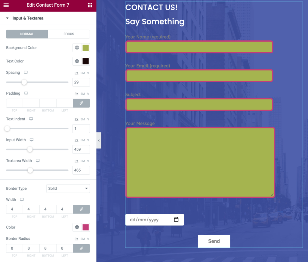
Consistent styling for these fields ensures your form looks polished and user-friendly.
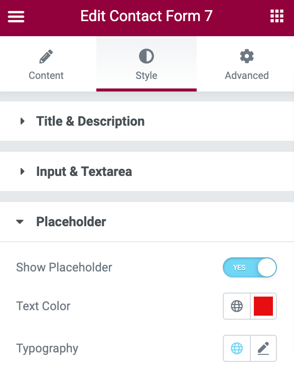
Style Placeholder Text
Use the placeholder customization options to control the appearance of placeholder text. Change the text color and typography or hide the placeholder text entirely if needed. Placeholder text should guide users on what information to enter without overwhelming them.
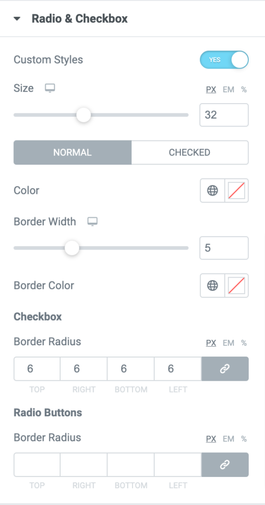
Customize Radio Buttons and Checkboxes
Enable custom styling for radio buttons and checkboxes. Adjust their size, color, and borders to enhance the form’s design. Adding distinct styles for these elements can improve usability and accessibility.
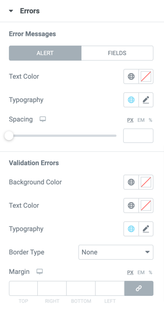
Style Error and Validation Messages
The error message customization options let you modify typography, background colors, text colors, and borders to make these messages clear and visually distinct. Make sure they are easily noticeable to help users correct their input quickly.
Design the Submit Button
The submit button is a key part of any form. Customize it by:
- Aligning it to the left, right, or center
- Adjusting the button width
- Changing background and text colors
- Modifying border radius and padding
- Configuring typography settings for the button text
A visually appealing submit button encourages users to complete and submit the form.
Additional Tips for Better Form Design
- Use Consistent Spacing: Maintain consistent spacing between form elements to improve readability and visual flow.
- Add Call-to-Action Text: Customize the submit button text to make it more engaging (e.g., “Send Message” or “Submit Request”).
- Test Your Form: After styling, test the form on different devices to ensure it is fully responsive and functional.
- Optimize for Speed: Avoid excessive design elements that could slow down your page load time.
Conclusion
Customizing Contact Form 7 with Elementor using the PowerPack addon provides an intuitive way to enhance your form’s design. By following these steps, you can create a professional and attractive form that aligns with your WordPress site’s aesthetic.
With these tools, you can style everything from titles and input fields to error messages and submit buttons, making your forms more engaging and user-friendly.
If you have questions or need help, drop a comment below, and we’ll assist you!

![How to Customize Contact Form 7 with Elementor [Complete Guide] Customize Contact Form 7 with Elementor](https://www.wpdisc.com/wp-content/uploads/2025/01/contact-form-7-with-elementor-1024x520.png)
![How to Have 2 Lines of Text in WordPress Header [5 Easy Ways] How to Have 2 Lines of Text in WordPress Header [5 Easy Ways]](https://www.wpdisc.com/wp-content/uploads/2025/02/how-to-have-2-lines-of-text-in-wordpress-header-1024x520.png)

![How to Clone My Website to a Second URL [9 Easy Steps] How to Clone My Website to a Second URL [9 Easy Steps]](https://www.wpdisc.com/wp-content/uploads/2025/01/how-to-clone-my-website-to-a-second-url-1024x520.png)
Leave a Reply